These are illustrative concepts for fictional venues, made to show how we think about layout, tone and the main action for different kinds of restaurant. They are not client websites and show no real results.
Concept one: Maison Lumen, fine dining
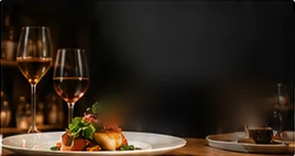
What the concept shows. A dark, quiet header with the restaurant's name in a serif face and three navigation items: menu, wine and booking. The first screen states what the place is, a modern French table with a seasonal tasting menu served Tuesday to Saturday, and offers one action: reserve a table. The photo side shows wine glasses and a plated dish in low light.
Why it is built this way. A tasting-menu restaurant sells an evening rather than a single dish. Guests planning a special occasion want to know when the restaurant is open and how to book; they will read the menu later. Putting the days of service and the booking button in the first screen answers the two questions that come first.
A full build in this direction would add a menu page that explains the tasting format and any supplements, a wine page, a private dining page with capacity and minimums, a visit page with dress code and parking, and a gift card link.
Concept two: Bramblewood Coffee, café
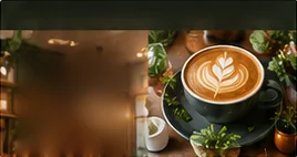
What the concept shows. A deep green header with the café's name and three navigation items: menu, hours and visit. The headline is short and friendly, and the supporting line gives the opening time and one detail about the food: pastries baked in house. The main button opens the menu. The photo side shows a latte in a dark cup.
Why it is built this way. For a café, the first questions are whether it is open now and what is on offer. Hours and menu lead the navigation, and the opening time sits right under the headline. There is no booking button, because this concept is a walk-in café.
A full build in this direction would add an HTML menu with drinks and food, hours for each day, a visit page with seating and accessibility notes, and a section for seasonal specials that staff can update in minutes.
Concept three: Harvest Counter, casual dining
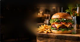
What the concept shows. A near-black header with bold, uppercase type in a sans-serif face, and three navigation items: menu, order and find us. The headline is short and confident, the supporting line names the food (burgers, bowls and fries) and the pickup time, and the main button starts a pickup order. The photo side shows a burger and fries on a wooden board.
Why it is built this way. A counter-service restaurant lives on quick decisions. The guest wants to see the food, know how long it takes and order. The order button leads, and the pickup time sets expectations before the guest commits.
A full build in this direction would add an online ordering flow connected to the restaurant's ordering system, a menu with photos of the main items, location pages if there is more than one site, and a page explaining delivery areas and fees in plain words.
What changes between the three
| Fine dining | Café | Casual | |
|---|---|---|---|
| Main action | Reserve a table | View menu | Order pickup |
| Type | Classic serif, uppercase headline | Serif headline, softer tone | Bold sans-serif, uppercase |
| Color | Near-black with brass accents | Deep green with sage | Near-black with amber |
| First-screen facts | Days of service, tasting format | Opening time, house baking | Food types, pickup time |
The details differ, but the logic is the same in each: decide the one thing most guests come to do, and make it obvious.
Want to see more?
We are happy to talk through how these directions would apply to your restaurant on a call. If you would rather start on your own, the planner helps you write a brief, and the design service page explains what a full build includes.
